Reality Kitchen

Overview.doc

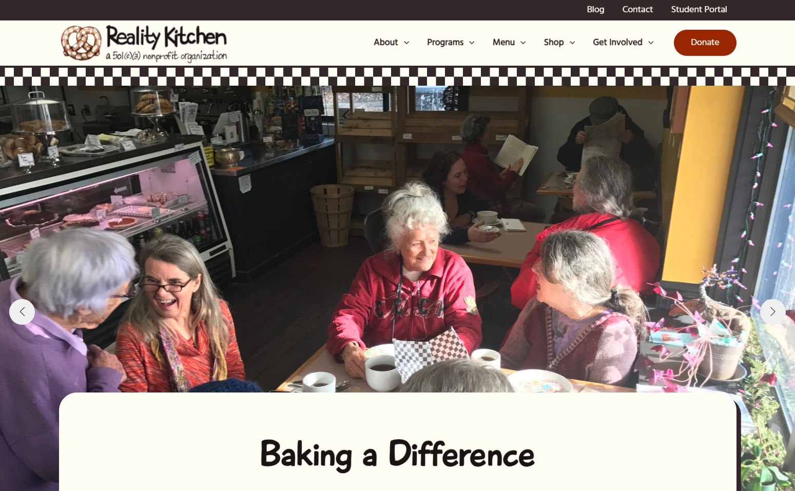
Cooking up a fun retro aesthetic for a growing community hub while maintaining brand recognizability and improving usability, accessibility, and clarity of purpose.

Reality Kitchen Nonprofit is an organization with many facets, and is ever growing and adding new services. The founder, Jim, had been looking to get the site redesigned for several years and after a recent disappointing experience with a design company, he still needed help.

In addition to their Café and Bakery, they were on the verge of opening a general store, a food truck, and a distance learning platform, and the founder was interested in introducing online ordering in the future.

The new site needed to direct customers to these establishments, inform the community of the educational programs offered, be easy for the founder to update himself, and have the capacity to scale with the organization.

Project Information

CONTEXT:

Volunteer
‎10 Weeks
‎3 Contributors

MY ROLE:

‏‏‎‎Project Manager
Guerilla Testing
Style Guide
Site Development
Quality Assurance

TOOLS:

Trello
Figma, Figjam
Google Suite
WordPress

Reality Kitchen Nonprofit
Discover

Define

Design

Deliver

Figure 1: Site Analysis

2 weeks

Discovery Phase

Heuristic Analysis

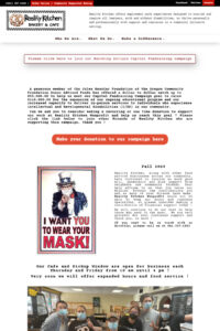
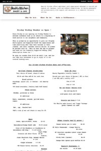
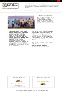
We conducted an in-depth analysis of the navigation and pages on the existing site and found many issues with consistency, accessibility, and functionality.

A large portion of navigation links led to blank or missing pages, and the homepage was serving as a news stream with outdated information and no timestamps.

See Figure 1 for examples.

Competitor Analysis

We found other organizations and companies which either had a similar mission, or acted as community hubs.

Next, we analyzed the design and structure of their sites and consulted with Jim to find out what he was drawn to in terms of style, structure, and types of elements.

Baseline Usability Testing

After identifying common tasks on the site, we tested the mobile and desktop navigation with real customers at Reality Kitchen’s café as well as with people who had never seen the site before.

Insights: Navigation Usability

Our primary research goal was to test usability of the existing navigation structure to determine whether reorganization or major structural changes were warranted.

What was working:

Testers liked that the donate button and phone number were easy to find.

What was NOT working:

The majority of testers struggled to find the pages they were looking for, some even entirely missed the navigation bar. Overall success rate was very low, with many users expressing confusion and/or frustration. See Figure 2 & 3.

Insights: User Feedback

Our secondary research goal was to gauge initial impressions of the existing site design, structure, and accessibility.

What was working:

Reading the mission statement gave testers positive feelings about the organization.

What was NOT working:

Testers frequently expressed confusion and uncertainty, with a pattern of mentioning too much text yet not enough useful information. See Figure 3.

Figure 2: Navigation Usability

Figure 3: User Feedback
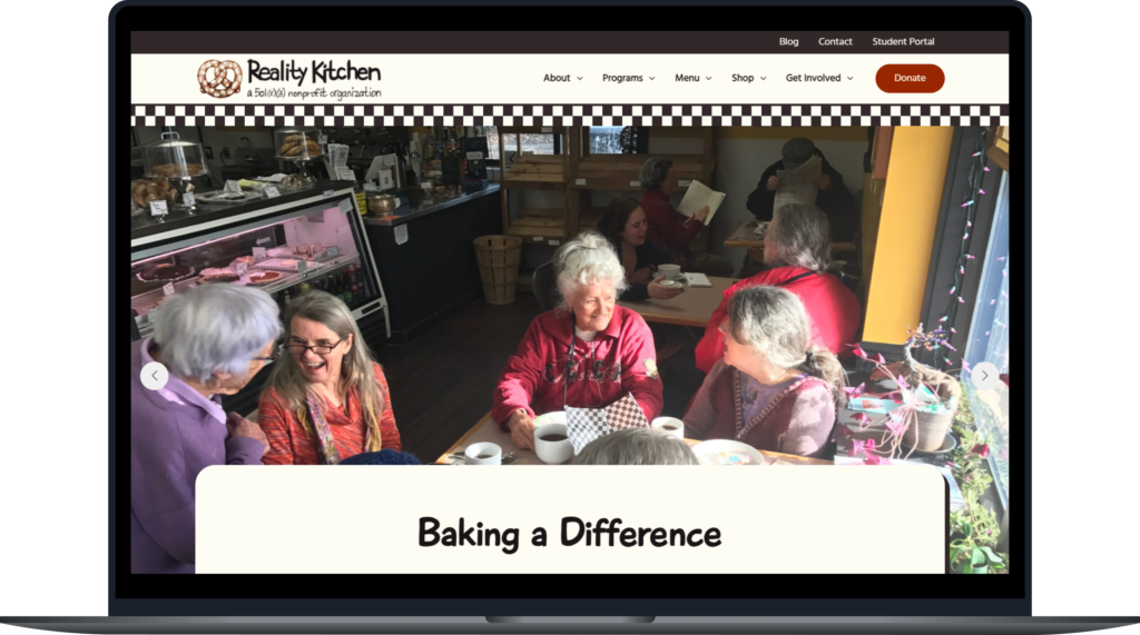
More info on our design process coming soon!

LINKS

LinkedIn
CodePen
GitHub
Style Guide
“People aren’t just people, they are people surrounded by circumstances.”