Eugene Electric Bicycles

Rebranding a local electric bicycle shop and creating informational resources for customers.

The Story

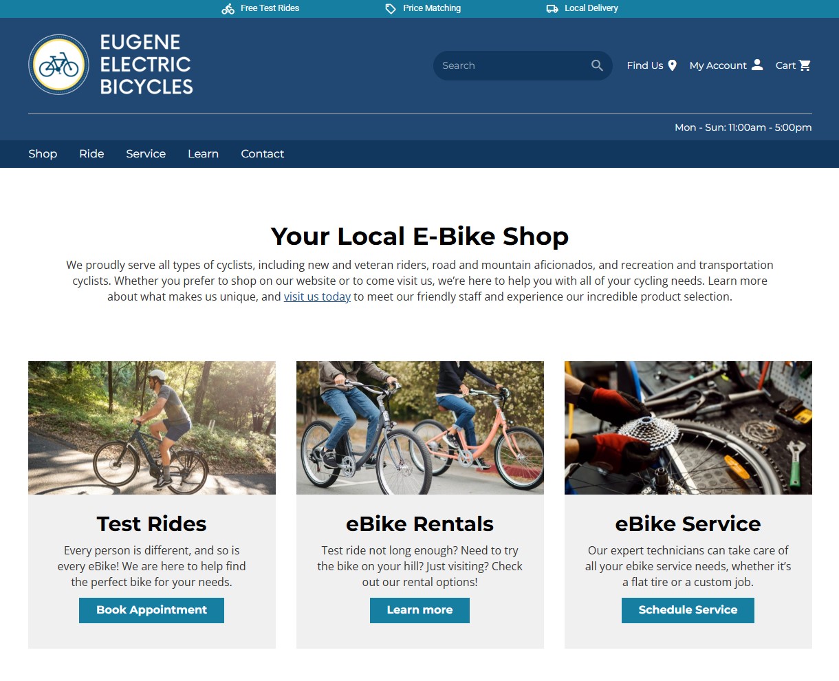
I first came to work at Eugene Electric Bicycles to rework their inventory system shortly after the company had changed ownership. A few months later they became interested in rebranding so I offered my services and created a new logo for them.

Though I maintained my prior duties, over time I continued to design for the company as the need arose, including designs for business cards, T-shirts, stickers, ads, social media, flags, banners, a website, and building signs.

Project Information

CONTEXT

Paid position
~2 Years
Sole Contributor

MY ROLE

Brand Designer
Graphic Designer

KEY INPUTS

Logo
Print Products
Brand Identity

TOOLS

Photoshop
Canva
Workstand
Promoboxx

Logo Rework

Before

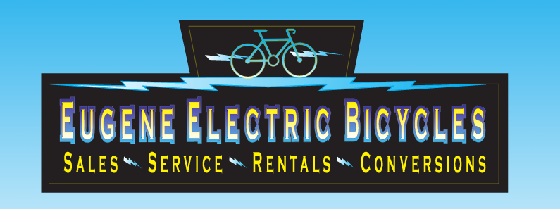
Below are some of the graphics that were in use on signs, stickers, flyers, and business cards. The graphics were a bit haphazard, with too many elements and gradients making it feel outdated and sometimes difficult to read.

After

The lightning bike was a good concept, so I tidied it up and made it the primary logo. To retain brand recognizability, I also kept the color scheme very close to the original, with some adjustments to make it feel brighter and more balanced.

A Beginner’s Guide to E-Bikes

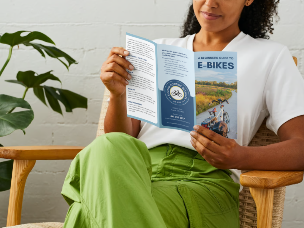
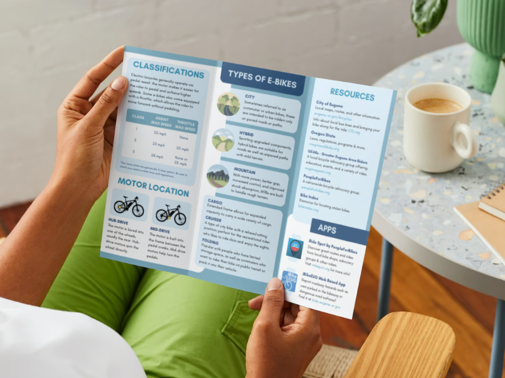
One of my favorite creations for this company is a trifold pamphlet containing introductory information and resources targeted towards people who are new to the world of e-bikes.

The Problem

After many months of passive observation, I identified an issue:

Being a small, family-owned retail shop with limited staff operating in a rapidly growing industry, it often happens some customers will come in while all the sales representatives are busy. These customers would usually be greeted and given a time estimate of when someone would be able to help them. Some would wander around looking at the different models while they waited patiently, and others would simply leave.

The Process

I took this opportunity to educate myself about the industry and the options available to our customers. In addition to independent research, I also consulted our knowledgeable e-bike service technicians.

I boiled all the information down into bite-sized copy that could easily be understood by a beginner, then I made miniature paper trifolds to plan the layout and visualize how the front and back panels would interact when folded.

I recreated the layout and designed the trifold in Canva, got it proof-read by a technician, approved by the owners, then sent it off for printing.

The Result

The impact has been highly positive for both staff and customers, and this trifold is now regularly re-ordered along with their business cards.

Busy staff can now greet customers then direct them to take a pamphlet from the front desk, or hand them out at events.

Curious customers now have more direction when arriving at a busy shop, and they have something informational to keep them entertained for a time.

Additionally, learning the basics before meeting with sales staff answers some initial questions they may have, and provides them some terms they can use to help them find the right type of bike for their needs.

Brand Guidelines

After learning about style guides in a UX/UI bootcamp, I organized and compiled all previous design decisions into a brand guide the owners could use and share with other designers in the future.